In today’s fast-paced digital world, user experience is everything. One key strategy that businesses are leveraging to enhance engagement and satisfaction is adaptive website design.
Unlike traditional or even fully responsive designs, adaptive design focuses on serving tailored layouts based on the specific device or screen resolution being used. This ensures an optimal experience for every visitor—whether they’re on a smartphone, tablet, laptop, or desktop.
But how exactly does this approach boost user engagement? Let’s explore.
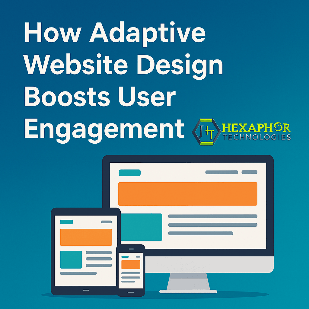
Adaptive Website Design refers to a design technique where multiple versions of a website layout are created, and the appropriate one is served based on the user’s device type or screen size. This differs from responsive design, which uses flexible grids that adjust dynamically.
For example:
A user on a 5-inch phone sees a streamlined version.
A tablet user sees a richer version with larger visuals.
A desktop user experiences a full-featured layout.
This adaptability means faster performance, better usability, and higher engagement.
Adaptive sites serve only the required layout and assets—not everything scaled down. This means faster load times, especially on mobile, where every second counts. Speed keeps users from bouncing and encourages deeper interaction.
By delivering a version of the website optimized for the device, users are less likely to struggle with zooming, scrolling, or misaligned elements. The result? Longer session durations and more completed actions (form fills, purchases, etc.).
Adaptive design maintains visual coherence across devices, which builds trust and reinforces brand identity. A consistent experience boosts user confidence and increases the likelihood of return visits.
Users that find it easier to navigate and complete tasks are more likely to convert. Adaptive design minimizes friction across devices, helping boost everything from newsletter signups to sales conversions.
In regions with slower internet, adaptive designs load smaller, lighter layouts. This increases accessibility and makes your website more inclusive, improving overall engagement in untapped markets.
Poor mobile experience is a leading cause of high bounce rates. Adaptive design solves this by serving device-optimized experiences that load fast and look great—keeping visitors on-site longer.
Because you’re serving different layouts, you can also track and optimize performance per device type. This leads to smarter decision-making and more personalized user journeys.
E-commerce platforms, SaaS tools, and corporate portals all benefit significantly from adaptive design. For instance, an e-commerce site can show a mobile-optimized cart with fewer steps, increasing mobile purchases by over 30%.
Not necessarily better, but better suited for certain use cases:
Use responsive design for simple content-driven websites.
Use adaptive design when user experience and performance are mission-critical, like for e-commerce, healthcare, or enterprise applications.
Yes, it’s designed to serve custom layouts for mobile, ensuring a better user experience than simple responsiveness.
Adaptive uses multiple fixed layouts for different devices; responsive uses a flexible grid to adjust dynamically.
Yes, adaptive sites with optimized performance and UX can boost rankings, especially on mobile searches.
E-commerce, SaaS, enterprise apps, and industries with complex user journeys benefit most.
Adaptive website design is a powerful way to boost engagement, performance, and conversions. By offering device-specific experiences, it respects the user’s context—something that today’s digital audience demands.
At Hexaphor Technologies, we specialize in adaptive website design solutions that maximize user interaction and long-term brand loyalty. Whether you're building a new platform or upgrading an old one, we’re here to help you engage smarter.